

爽筷台菜
預製菜品牌重塑
該設計專案品牌名稱叫做「爽筷台菜」,靈感來自創始人廖清爽,大家都叫他「爽哥」。我們把「爽」和「筷」結合,融合著幽默的諧音和食物的精髓。就像品嚐美味的食物一樣,讓人心情愉悅。
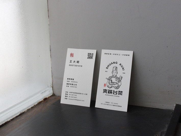
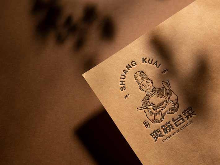
品牌標誌是個窗花圖案,融入「爽」的字形,呈現家人共享美食的情景。次要商標以傳統版畫風格展現創始人形象,傳遞對台菜傳統的敬意。我們也重新設計了食品包裝,根據食品的種類利用色彩和種類的標章來呈現「爽筷台菜」特色。
我們的概念是帶來家的溫馨感覺和美味的食物體驗。期待與你分享這個美味的旅程!有任何想法,歡迎告訴我們!
This design project's brand name is "Shuang Kua Tai Cai," inspired by its founder, Mr. Liao Qing Shuang, affectionately known as "Brother Shuang." We combined "Shuang" and "Kua" to create a playful harmony of sounds, blending humor and the essence of food. Just like savoring delicious cuisine, it brings a joyful mood.
The brand logo features a window art pattern incorporating the shape of "Shuang," depicting a scene of families sharing delightful meals. The secondary logo portrays the founder's image in a traditional woodcut style, conveying respect for the traditions of Taiwanese cuisine. We also redesigned the food packaging, using colors and category emblems to highlight the distinctive traits of "Shuang Kua Tai Cai" based on the type of food.
Our concept aims to bring the warmth of home and a delectable culinary experience. We look forward to sharing this delightful journey with you! If you have any thoughts, feel free to let us know.
爽筷台菜
2023
年份
客戶
品牌設計與規劃 |包裝設計 |3D CGI 設計
Brand Identity |Packaging Design |3D CGI Design
爽筷台菜
預製菜品牌重塑
品牌設計與規劃 |包裝設計 |3D CGI 設計
Brand Identity |Packaging Design |3D CGI Design
此設計專案為一個展覽設計,其目標在於設計一套可重複使用的展示系統,並展現客戶的品牌特色。客戶為一家橡膠製品代工廠商,我們研究了客戶的產品後,將其產品進行分類,並進行整合和規劃。主要的展示牆設計包括七幅不同主題的海報,每幅海報都由不同的細小橡膠零件組成,突出了小零件大用途的品牌精神。這個設計不僅能夠展示客戶的產品,還能夠凸顯其獨特的品牌形象,從而提高客戶的品牌知名度。此外,我們的設計也考慮了展示系統的可重複使用性,使得客戶能夠節省展覽成本,同時也提高了展覽系統的可持續性。
This design project is an exhibition design aimed at designing a reusable exhibition display system that can showcase the client's brand characteristics. The client is a rubber product contract manufacturer. After studying its products, they were classified and integrated for planning. The main visual wall of the exhibition was designed with seven posters of different themes composed of different small rubber parts, showcasing the brand spirit of "small in size, huge in usage".
該設計專案品牌名稱叫做「爽筷台菜」,靈感來自創始人廖清爽,大家都叫他「爽哥」。我們把「爽」和「筷」結合,融合著幽默的諧音和食物的精髓。就像品嚐美味的食物一樣,讓人心情愉悅。
品牌標誌是個窗花圖案,融入「爽」的字形,呈現家人共享美食的情景。次要商標以傳統版畫風格展現創始人形象,傳遞對台菜傳統的敬意。我們也重新設計了食品包裝,根據食品的種類利用色彩和種類的標章來呈現「爽筷台菜」特色。
我們的概念是帶來家的溫馨感覺和美味的食物體驗。期待與你分享這個美味的旅程!有任何想法,歡迎告訴我們!
This design project's brand name is "Shuang Kua Tai Cai," inspired by its founder, Mr. Liao Qing Shuang, affectionately known as "Brother Shuang." We combined "Shuang" and "Kua" to create a playful harmony of sounds, blending humor and the essence of food. Just like savoring delicious cuisine, it brings a joyful mood.
The brand logo features a window art pattern incorporating the shape of "Shuang," depicting a scene of families sharing delightful meals. The secondary logo portrays the founder's image in a traditional woodcut style, conveying respect for the traditions of Taiwanese cuisine. We also redesigned the food packaging, using colors and category emblems to highlight the distinctive traits of "Shuang Kua Tai Cai" based on the type of food.
Our concept aims to bring the warmth of home and a delectable culinary experience. We look forward to sharing this delightful journey with you! If you have any thoughts, feel free to let us know.
此設計專案為一個展覽設計,其目標在於設計一套可重複使用的展示系統,並展現客戶的品牌特色。客戶為一家橡膠製品代工廠商,我們研究了客戶的產品後,將其產品進行分類,並進行整合和規劃。主要的展示牆設計包括七幅不同主題的海報,每幅海報都由不同的細小橡膠零件組成,突出了小零件大用途的品牌精神。這個設計不僅能夠展示客戶的產品,還能夠凸顯其獨特的品牌形象,從而提高客戶的品牌知名度。此外,我們的設計也考慮了展示系統的可重複使用性,使得客戶能夠節省展覽成本,同時也提高了展覽系統的可持續性。
This design project is an exhibition design aimed at designing a reusable exhibition display system that can showcase the client's brand characteristics. The client is a rubber product contract manufacturer. After studying its products, they were classified and integrated for planning. The main visual wall of the exhibition was designed with seven posters of different themes composed of different small rubber parts, showcasing the brand spirit of "small in size, huge in usage".
爽筷台菜
預製菜品牌重塑
品牌設計與規劃 |包裝設計 |3D CGI 設計
Brand Identity |Packaging Design |3D CGI Design
該設計專案品牌名稱叫做「爽筷台菜」,靈感來自創始人廖清爽,大家都叫他「爽哥」。我們把「爽」和「筷」結合,融合著幽默的諧音和食物的精髓。就像品嚐美味的食物一樣,讓人心情愉悅。
品牌標誌是個窗花圖案,融入「爽」的字形,呈現家人共享美食的情景。次要商標以傳統版畫風格展現創始人形象,傳遞對台菜傳統的敬意。我們也重新設計了食品包裝,根據食品的種類利用色彩和種類的標章來呈現「爽筷台菜」特色。
我們的概念是帶來家的溫馨感覺和美味的食物體驗。期待與你分享這個美味的旅程!有任何想法,歡迎告訴我們!
This design project's brand name is "Shuang Kua Tai Cai," inspired by its founder, Mr. Liao Qing Shuang, affectionately known as "Brother Shuang." We combined "Shuang" and "Kua" to create a playful harmony of sounds, blending humor and the essence of food. Just like savoring delicious cuisine, it brings a joyful mood.
The brand logo features a window art pattern incorporating the shape of "Shuang," depicting a scene of families sharing delightful meals. The secondary logo portrays the founder's image in a traditional woodcut style, conveying respect for the traditions of Taiwanese cuisine. We also redesigned the food packaging, using colors and category emblems to highlight the distinctive traits of "Shuang Kua Tai Cai" based on the type of food.
Our concept aims to bring the warmth of home and a delectable culinary experience. We look forward to sharing this delightful journey with you! If you have any thoughts, feel free to let us know.